9×12 Template Ad Design Tutorial
Section 4:
Changing the Background
Gradients
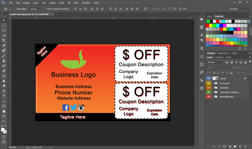
For this tutorial, I’ll use template “small1.psd”, but it really doesn’t matter, the same concepts apply to all the templates. Remember first to WORK ON A COPY OF THE ORIGINAL TEMPLATE FILE, NOT THE ORIGINAL!
Once you’ve got your copied template open, you should have a screen that looks like this:
If the background of Photoshop is light grey instead of dark grey, it’s OK, it just means you’re on an earlier version of photoshop instead of CC. It may help to pick the “essentials” workview at the top right of the screen so that it’s organized similar to mine here.
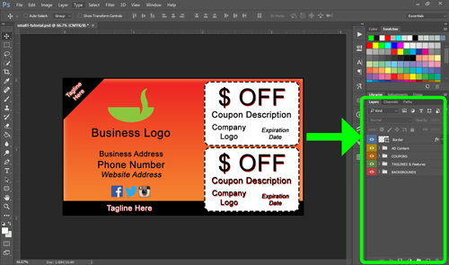
LAYERS PANEL
You’ll be using the “layers” panel a lot. It should be in the bottom right of your screen, labeled Layers (see the pic below I’ve highlighted in Neon Green). If you don’t see the panel for some reason, go to: Window > Layers or click the shortcut (F7) to enable it.
You’ll notice I have my layer panel taking up a lot of the sidebar. I do that by hovering my mouse over the tab that says Layers until the cursor turns into a double-sided arrow, then I click and drag it upwards so it takes up more real estate. Because you’ll use this panel a lot, it’s nice to keep it expanded.
BACKGROUND LAYER FOLDER
To change the background, you’ll be working in the layer folder labeled BACKGROUNDS. We’ve color coded it Red and it’s positioned as the very bottom layer. Notice the Eyeball to the left of it. That eyeball is what determines whether something is visible or not. If you click the eyeball, you’ll see that the background disappears and turns into a checkmarked area:
![]()
Those checkmarks mean that something is transparent. Since you clicked the eyeball and made the whole layer folder invisible, everything in the background is invisible. Check the eyeball again and you’ll see that the background shows up again.
Now, unpack the BACKGROUNDS folder by clicking the little arrow between the eyeball and the BACKGROUNDS title. It should look like this:
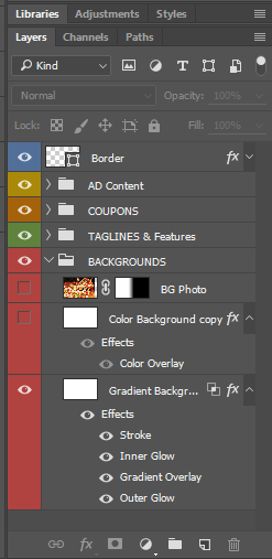
Notice that not everything in the layer folder is visible (it’s missing ‘eyeballs’). That’s because we may want to switch the type of background around and using the eyeballs make it easy to pick what you want displayed or not.
There’s three background sub-layers made for you: A Photo Image, Color Background, and Gradient Background.
USING A GRADIENT AS A BACKGROUND
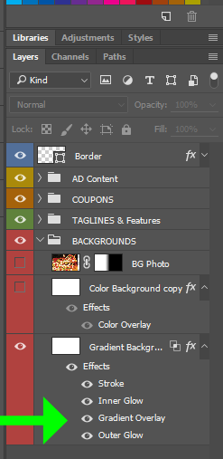
The bottom layer should be currently visible and titled: Gradient Background. This is how (obviously) you choose a gradient background. Make sure the layer above it (the color one) isn’t visible or else it will “cover” the gradient background and you won’t see your gradient. Make sure Gradient is the only one with an eyeball active.
If you want to change the gradient color, simply double click the “gradient overlay” option here:
The “layer styles” window will pop up like this:
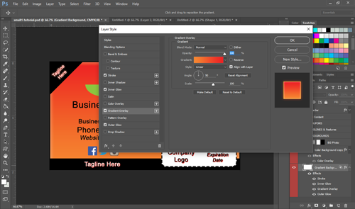
Layer styles are fantastic. They essentially stylize any layer you have, which could mean colors, texts, shapes, or whatever. This is where you can have a lot of fun adding drop shadows, gradients, color changes, emboss, outlines (called ‘strokes’), glows, and lots of cool stuff. Don’t get carried away though. Right now let’s just focus on changing a gradient color around.
One of the cool things you can do before changing colors is move the gradient around. All you’ve got to do is click your mouse outside of the layer styles window, hold it, and drag it around. You’ll see the gradient move:
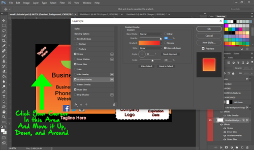
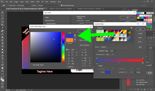
This is a great way to simply pick how much of the dark or light part of the gradient shows up in the background. To change the actual colors of the gradient, you’ll need to click the gradient color bar in the layer styles window. One click of that color bar and you’ll see the gradient editor:
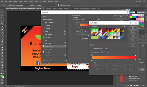
This is where you pick from saved gradients or create your own. In the gradient color bar, notice it shows the gradual change from orange to red.
There’s little boxes at each end, on the top and bottom:
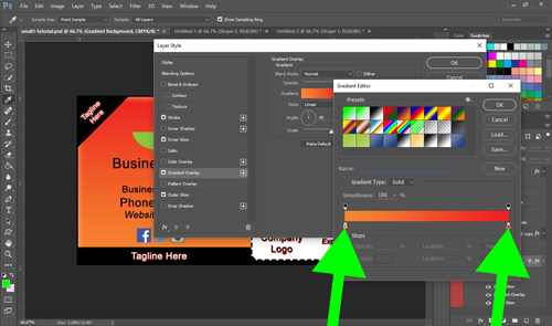
Double click one of the colored boxes and you’ll see the color picker come up. This is where you change the color of one side of the gradient. Just click your color around and pick what you want. You do the same for the other side of the gradient, typically going a slightly lighter or darker shade so it makes a nice smooth change.
Note: when you’re picking your colors out … you may see this little triangle warning sign:
This is REALLY important. That little triangle warning means that it’s a color shade that can’t be printed accurately. Photoshop can display a huge spectrum of color on your screen, but the colors that can be printed on paper are limited. If you click the warning triangle, it will conveniently move your color to the closest print-able shade.